Welcome to CarmenB's Portfolio
CarmenB is a young artist and graphic designer with works ranging from branding, posters, collages, and illustrations. With a focus on colorful, modern, and fresh designs, she aims to bring a unique perspective to each project.
Here, you will find a selection of her branding works that showcase her skills and creativity. Take a look and get inspired!
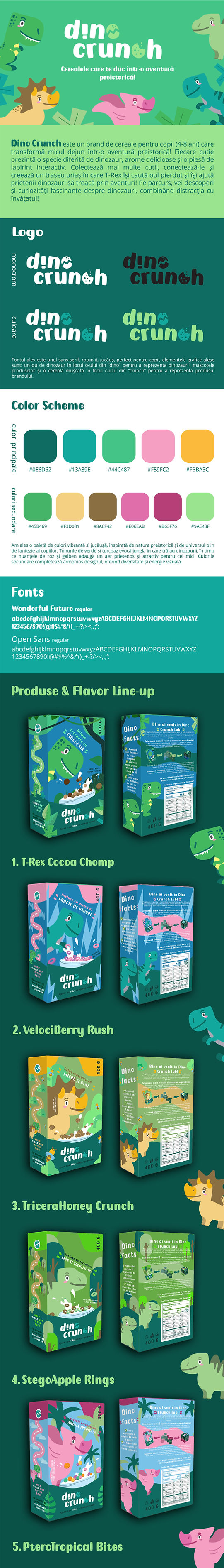
01. dinocrunch
DinoCrunch is a playful cereal branding project created for children aged 4–8, transforming breakfast into an interactive prehistoric adventure. Carmen Burnar developed a vibrant and engaging visual identity, combining a colorful palette inspired by the jungle with custom typography that features a cracked cereal "C" and a dino egg "O." Each box introduces a new dinosaur species, fun facts, and an interactive labyrinth piece, encouraging kids to collect, learn, and play. Designed with sustainability and creativity in mind, DinoCrunch is more than a cereal—it's an educational, hands-on experience that blends fun with discovery.


02. vinify
Vinify is a premium wine branding concept that reimagines traditional winemaking through a refined blend of heritage and innovation. Carmen Burnar crafted a sophisticated visual identity that reflects the elegance of the winery’s mission—uniting sustainable viticulture with cutting-edge techniques. The branding combines a modern geometric logo inspired by the shape of a wine glass, a clean sans-serif typeface, and a rich color palette evoking terroir, tradition, and vibrancy. Each wine label tells a sensory story—Vinify Blanc, Rosé, and Rouge—celebrating nature, craftsmanship, and contemporary taste in every detail.
03. Iacob foundation
The branding for the Iacob Foundation draws inspiration directly from the expressive power of their art collection, transforming their mission into a visual identity rooted in emotion, culture, and community. Carmen Burnar developed a design system that echoes the textures, colors, and brushstrokes found in the foundation’s paintings, creating a warm and authentic identity that reflects their dedication to supporting artistic expression and cultural heritage in Romania. Through a balanced use of painterly elements and modern design clarity, the branding bridges tradition with contemporary relevance.

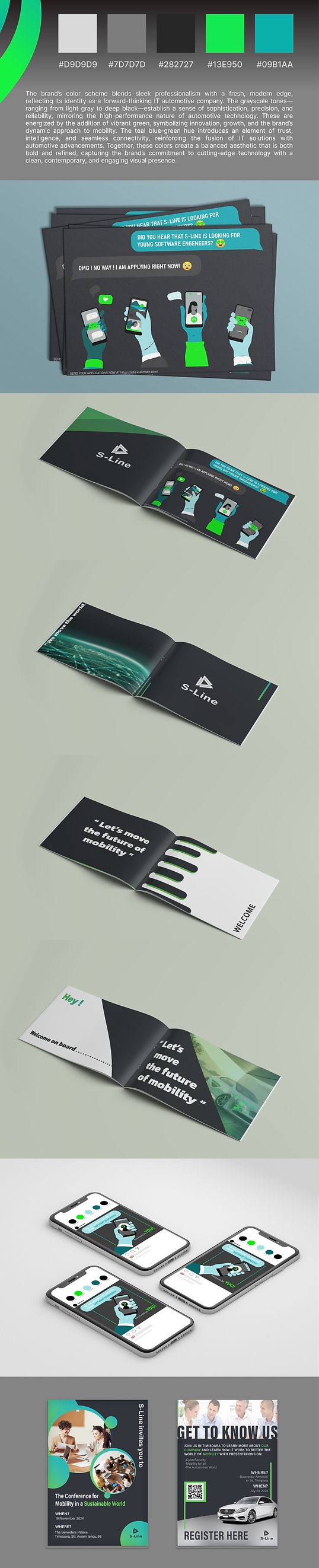
04. S-line IT
S-Line IT is a fictional tech branding concept developed to reflect innovation, precision, and streamlined digital solutions. Carmen Burnar created a sleek and modern visual identity built around the idea of fluid connectivity and clean systems. The logo and graphic elements emphasize minimalism and motion—symbolizing the company’s agile approach to IT services. With a cool-toned color palette, geometric typography, and a consistent visual system, the branding positions S-Line IT as a forward-thinking and reliable tech partner in the digital landscape.
05. ȘPAIS
Șpais is a fictional brand that reimagines the traditional Romanian pantry as a timeless, heartwarming presence in every kitchen. Carmen Burnar developed a visual identity that feels both familiar and fresh—infused with the warmth of home-cooked meals and the quiet elegance of modern design. Rooted in heritage, the branding combines earthy colors, nostalgic textures, and soft, inviting typography to create a sense of trust, comfort, and togetherness. Whether passed from grandparents to grandchildren or shared among friends, Șpais speaks to a whole generation of home cooks—those who cherish tradition but embrace simplicity and good taste.


06. Studio Terra
Studio Terra is a fictional pottery brand that celebrates the grounding beauty of earth and form. Carmen Burnar crafted a visual identity that blends minimalism with warmth—using organic shapes, muted earthy tones, and playful graphic touches to evoke a sense of calm, creativity, and craftsmanship. Rooted in the slow process of handmaking, the brand captures the quiet joy of shaping clay into meaningful, everyday objects. With a tone that’s both refined and inviting, Studio Terra honors the connection between maker, material, and the simple rituals of daily life.
07. eden`s garden
Șpais is a fictional brand that reimagines the traditional Romanian pantry as a timeless, heartwarming presence in every kitchen. Carmen Burnar developed a visual identity that feels both familiar and fresh—infused with the warmth of home-cooked meals and the quiet elegance of modern design. Rooted in heritage, the branding combines earthy colors, nostalgic textures, and soft, inviting typography to create a sense of trust, comfort, and togetherness. Whether passed from grandparents to grandchildren or shared among friends, Șpais speaks to a whole generation of home cooks—those who cherish tradition but embrace simplicity and good taste.


08. Paw Land
Pawland is a fictional pet brand designed with a playful heart and a clean, modern aesthetic. Carmen Burnar developed a vibrant and friendly visual identity that speaks to pet lovers who value both design and care. With soft rounded typography, colorful accents, and cheerful illustrations, the branding creates an inviting world where pets and their humans connect through joy, trust, and everyday moments. Whether it’s packaging, signage, or social media, Pawland captures the lively spirit of a modern pet lifestyle with warmth and charm.